

Your client's skin is not a passive canvas; it's a complex, living filter that actively dictates the final hue of every drop of ink you deposit. Mastering tattoo colour theory for artists requires moving beyond basic art school principles and into the realm of dermal physics. It's a common frustration to watch a vibrant piece turn muddy or lose its saturation during the healing process, especially when you're navigating the nuances of different melanin levels. You've likely felt that sting of uncertainty when a carefully mixed pigment reacts unexpectedly with a client's unique biology.
This guide unlocks the technical secrets of how modern, REACH-compliant pigments interact with various skin tones to ensure your work remains as intentional as the day it was finished. We'll provide a methodical breakdown of how to predict healed results and achieve consistent saturation in colour realism by understanding the chemistry of living pigment. By the end, you'll have the advanced knowledge needed to replace uncertainty with controlled, predictable progress on every skin type.
Key Takeaways
- Understand how light refracts through healed skin layers, treating the epidermis as a biological filter to accurately predict final hues.
- Master the application of tattoo colour theory for artists by using the Fitzpatrick Scale to select pigments that maintain vibrancy across diverse skin tones.
- Learn to identify the dermal "sweet spot" for optimal saturation while managing how temporary trauma-induced redness skews your visual perception.
- Discover how to use analogous colour schemes and anatomical flow to create a sense of movement and structural harmony in your designs.
- Simplify your professional workflow by curating a versatile palette of high-quality inks that ensure predictable healing and long-term stability.
Beyond the Colour Wheel: The Clinical Science of Tattoo Pigments
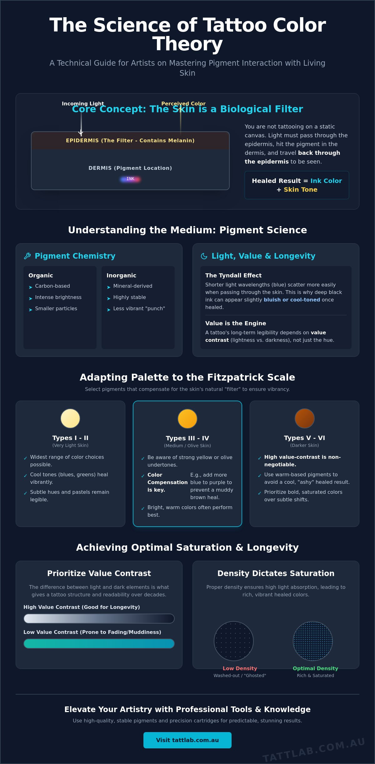
Traditional art theory assumes a static, white background. In the studio, the reality is far more dynamic. Understanding tattoo colour theory for artists means accepting that you aren't painting on a surface; you're embedding light-absorbing particles beneath a living, shifting filter. While standard colour wheels help with basic composition, they fail to account for the biological variables of the human body. True mastery lies in predicting how light refracts through the healed epidermis to interact with the pigment resting in the dermis.
We work in a subtractive colour system. Pigments absorb certain wavelengths of light and reflect others back to the viewer. However, because the skin is translucent, we also deal with light scattering. Pigment density is the primary variable you control. High density leads to higher absorption and richer saturation, while low density allows more light to pass through the pigment layer, resulting in a washed-out or "ghosted" appearance. Value dictates longevity. Many artists obsess over hue, but value, the relative lightness or darkness of a colour, is the actual engine of a tattoo. It's the most critical factor in long-term legibility because as pigments settle and the skin ages, the contrast between values is what maintains the image's structure.
Pigment Chemistry: Organic vs. Inorganic Inks
The molecular structure of your medium dictates its performance. Organic pigments are carbon-based and typically offer smaller particle sizes, which results in intense brightness and easy saturation. Conversely, inorganic pigments are derived from minerals and earth oxides. These are generally more stable but lack the punchy vibrance of organics. You can learn more about these chemical compositions in The Science of Tattoo Pigments. Warm tones like yellows and oranges often feature larger molecular structures that are more susceptible to UV degradation, leading to faster fading than cooler, more stable blues or greens. Selecting high-quality Tattoo Inks with stable carrier fluids ensures these particles remain in suspension, preventing the settling that leads to inconsistent healed results.
The Physics of Light and the Dermal Layer
Light must travel through the epidermis, hit the pigment in the dermis, and travel back through the epidermis to reach your eye. This double-pass through the skin’s melanin and keratin significantly alters the perceived colour. This is most evident in the Tyndall effect. It's the same physical phenomenon that makes the sky look blue; shorter wavelengths scatter more easily when they hit small particles. This scattering is why a deep black ink can appear slightly bluish or cool once it's buried under several layers of skin. Chromaticity is the objective specification of a colour's quality, defined by its hue and saturation as it appears once filtered through the healed dermal tissue.
The Biological Filter: Predicting Pigment Interaction with Skin Tones
Mastering tattoo colour theory for artists requires a fundamental shift in perspective. You must stop viewing the skin as a blank page and start seeing it as a lens. The epidermis is not clear; it functions as a biological filter, a tinted transparency that sits permanently between the observer's eye and the pigment you've deposited in the dermis. This means the healed result is never the colour of the ink in the cap, but rather the sum of the ink plus the client's unique skin tone.
To predict this interaction with clinical precision, professional artists rely on the Fitzpatrick Scale. This tool categorizes skin types (I through VI) based on their response to UV light and their melanin content. For a specialist, this scale isn't just a dermatological reference; it's a guide for pigment selection. As melanin levels increase, the "filter" becomes denser and warmer, which can significantly dull certain wavelengths of light. Understanding this allows for colour compensation, the practice of intentionally shifting your ink hue to counteract the skin's natural tint. If you're working on skin with heavy yellow undertones, for example, your purples may need more blue saturation to prevent them from healing into a muddy brown. Ensuring your tools match this level of precision is vital, so consider upgrading your kit with high-performance tattoo cartridges designed for optimal pigment delivery.
Melanin and Colour Vibrancy
Melanin acts as a gatekeeper for light. In darker skin tones, the higher concentration of melanin absorbs more light before it can reach the pigment and reflect back. This is why high-contrast palettes are non-negotiable for deeper tones. To ensure legibility, you must prioritize value contrast over subtle hue shifts. The common "ashy" effect occurs when cool-toned pigments are used on skin that already has a cool or neutral base without enough warmth to balance the healed look. By selecting pigments with warmer bases, you can maintain vibrancy and prevent the design from looking desaturated over time. Adhering to FDA Tattoo Ink Safety Regulations ensures that the pigments you choose are not only vibrant but also meet the highest standards for biological compatibility.
Undertones: The Hidden Variable
While the surface tone is obvious, the undertone is the subtle hue beneath the skin: pink (cool), yellow (warm), or olive (neutral/cool). You can identify these by checking the veins or how the skin reacts to pressure. Olive undertones are particularly tricky; their green tint can aggressively neutralize reds, turning a vibrant crimson into a dull brick colour. Using complementary colours to neutralize these undertones is a hallmark of an advanced artist. For complex colour realism, performing a "colour map" or small ink test in a discreet area can provide a predictable preview of how the client's biology will filter your specific palette, replacing guesswork with scientific certainty.
Structural Harmony: Applying Colour Schemes to Anatomical Flow
Static art theory falls short when applied to the moving contours of a human limb. Advanced tattoo colour theory for artists treats hue as a structural element rather than just a decorative choice. By aligning specific colour temperatures with muscle groups and joint placement, you can enhance the natural musculature and ensure the design feels integrated with the body. Warm tones naturally appear to advance toward the viewer, making them ideal for the "peaks" of a muscle, while cool tones recede into the "valleys," creating depth and dimension without relying solely on heavy black shading.
Large-scale compositions benefit from a disciplined approach to colour distribution. Applying a modified "Rule of Thirds" ensures the piece remains legible from a distance. Dedicate one third of the composition to a dominant primary hue, one third to supporting secondary tones, and the final third to high-contrast accents or neutral space. This balanced distribution prevents visual fatigue and maintains a clear hierarchy of information as the eye moves across the limb. When planning these schemes, referencing Color Theory for Different Skin Tones helps you adjust these ratios to maintain structural harmony across various biological backgrounds.
Complementary Contrast for Maximum Impact
In Neo-Traditional and Illustrative work, complementary schemes utilize opposite hues to create immediate visual tension. While this makes focal points pop, it carries the risk of "vibrating boundaries." This optical phenomenon occurs when two highly saturated, opposite colours meet, causing the eye to struggle with the border. To mitigate this, use a neutral buffer, such as a fine grey wash or a skin-tone gap, to separate the competing hues. This strategy is your best defence against the natural softening effects of time; high-contrast boundaries remain legible even as the pigment slightly migrates within the dermis.
Analogous Blending and Gradients
For colour realism, analogous schemes provide the seamless transitions required for lifelike textures. These schemes use colours that sit adjacent to each other on the wheel, such as a transition from deep violet to magenta and then to soft pink. The secret to a smooth gradient lies in the "bridge colour," a mid-tone mix that physically links two disparate hues during the tattooing process. Utilizing Long Taper Needles is essential here; their extended point allows for softer, layered pigment delivery, which is necessary for building the delicate, transparent layers that define high-end realism.
Technical Execution: Saturation, Mixing, and Stability
Precision in the application of tattoo colour theory for artists requires more than just a keen eye; it demands an understanding of dermal architecture. The "sweet spot" for pigment deposition lies within the upper dermis, typically between 1.5mm and 2mm deep. If the needle remains too shallow, the pigment is lost during the epidermal shedding process. Conversely, going too deep risks migration and the dulling effect of excess tissue coverage. Achieving the perfect saturation means finding the balance where the pigment is dense enough to be vibrant but not so deep that it loses its intended hue.
A significant challenge during the session is "blood mixing." As the skin undergoes trauma, localized redness and interstitial fluid rise to the surface, creating a temporary red filter over your work. This biological response skews your perception, often making yellows appear orange or cool blues look muddy. Experienced specialists learn to trust their palette and their process rather than their immediate visual feedback. To maintain the integrity of these pigments long after the session, directing clients toward proper aftercare is essential for preserving the molecular structure of the ink during the critical first phase of healing.
In-Cap Mixing vs. Layering on Skin
Premixing custom hues in the cap ensures absolute consistency, which is vital for large-scale work spanning multiple sessions. However, layering transparent pigments directly in the skin allows for a luminous, multi-dimensional depth that premixing cannot replicate. To avoid cross-contamination, always manage the "dip" by working from your lightest pigments to your darkest. If you must return to a lighter cap, use a fresh rinse cup to ensure no dark particles compromise the purity of your lighter tones. For consistent pigment delivery in every pass, consider upgrading to high-precision tattoo cartridges that offer superior flow control.
Saturation and Skin Integrity
Maximum saturation occurs when the dermal layer is fully occupied by pigment particles without causing excessive tissue trauma. Over-working a specific area leads to "chewed" skin, which triggers an aggressive immune response that can reject the pigment entirely or result in permanent scarring. This rejection is often mistaken for poor ink quality when it is actually a failure of technical execution. Always reserve white highlights for the final step of the process. Because white pigment has a larger molecular size, it requires a fresh, calm area of skin to settle correctly and provide that final, clinical "pop" of contrast that defines high-end realism.
Curating Your Palette: Professional Ink Selection for Modern Studios
Building a professional kit doesn't require hundreds of individual bottles. Instead, it requires a strategic selection based on the principles of tattoo colour theory for artists. A versatile starter palette should focus on high-chroma primaries, a range of opaque greys, and essential modifiers. This minimalist approach allows you to mix exact hues while maintaining a deep understanding of how each component behaves. By limiting your initial palette, you master the chemistry of your medium before expanding into more specialized, muted tones like terracotta or sage green, which are currently trending in modern boutique studios.
Selecting high-quality Tattoo Inks is the foundation of predictable healing. When evaluating brands, look beyond marketing and focus on three clinical metrics: pigment load, flow rate, and lightfastness. High pigment load ensures you achieve saturation with fewer passes, which reduces tissue trauma and inflammation. A consistent flow rate allows the ink to move effortlessly from the reservoir to the dermal layer without clogging. Finally, lightfastness determines how well the particles resist UV degradation over decades. Batch consistency is equally vital; professional-grade supplies must offer the exact same hue and viscosity from one bottle to the next to ensure multi-session pieces remain cohesive.
The Essential Professional Toolkit
Every specialist needs a reliable set of opaque greys and skin tone modifiers to navigate the biological filter effect. These tools allow you to adjust the value and temperature of a pigment without losing its structural integrity. Your choice of black ink should also be specialized. A high-viscosity lining black ensures crisp, non-migrating edges, while a lower-pigment-load shading black or grey wash set provides the transparency needed for smooth transitions. Pre-dispersed inks are generally preferred in modern environments because they offer a consistent viscosity that eliminates the need for manual thinning, reducing the variables that can lead to inconsistent healed results.
Why Quality Supplies Dictate Artistic Outcomes
Tatt Lab supports this methodical approach by providing a curated selection of vetted pigments and medical-grade PPE. We understand that artistic excellence is inextricably linked to physical integrity. Studio hygiene and the use of high-quality barriers aren't just safety protocols; they're essential for preventing the immune response that can dull the vibrancy of a healed colour tattoo. As regulations like the EU's REACH and the U.S. MoCRA continue to evolve in 2026, it's the artist's responsibility to stay educated on pigment safety. Partnering with a specialist supplier ensures your studio remains at the forefront of these advancements, allowing you to focus on the liberating narrative of personal transformation you provide for every client.
Elevating Your Art Through Dermal Science
Transitioning from a standard artist to a dermal specialist requires a profound respect for the physics of light and human biology. You've explored how the epidermis acts as a permanent filter and learned why technical precision in saturation is the only way to combat the natural softening of time. Mastering tattoo colour theory for artists isn't just about the wheel; it's about predicting the future of a living piece. By understanding the chemical stability of your pigments and the anatomical flow of the body, you replace guesswork with scientific certainty.
To achieve these predictable, high-end results, your studio requires tools that match your technical rigor. As an artist-owned and operated facility, we provide clinical-grade medical supplies and vetted pigments designed for the modern professional. We offer nationwide express shipping across Australia to ensure your workflow remains uninterrupted. Explore our range of professional-grade Tattoo Inks and supplies at Tatt Lab. Your commitment to dermal science ensures that every piece you create is a lasting testament to your skill and your client's transformation. Stay meticulous, stay curious, and continue to push the boundaries of what living pigment can achieve.
Frequently Asked Questions
Why do my colour tattoos look dull once they have fully healed?
Healed tattoos look different because the epidermis acts as a biological filter over the pigment. During the session, you're viewing ink through damaged, translucent skin; once the skin regenerates, melanin and new tissue sit on top of the dermis, absorbing light. Applying tattoo colour theory for artists allows you to select hues that are saturated enough to remain vibrant even after this natural filtration occurs.
How do I choose the best tattoo colours for dark skin tones?
Prioritize high value contrast and warmer pigment bases to ensure the design remains legible against higher melanin levels. Because darker skin absorbs more light, subtle hue shifts often get lost. Choosing pigments that are warmer or more saturated than the target colour helps counteract the skin’s natural cool or neutral filter, preventing the finished piece from appearing ashy or muted.
What is the difference between organic and inorganic tattoo inks?
Organic pigments are carbon-based and known for their small particle size, which produces intense brightness and easy saturation. Inorganic pigments are mineral-based, often using earth oxides for greater stability and resistance to fading. While organics offer more vibrance, inorganics are frequently used for their longevity and predictable healing, particularly in more muted or natural palettes.
Can I mix different brands of tattoo ink to get a custom colour?
While physically possible, mixing brands can lead to inconsistent healed results due to differing chemical formulations. Each manufacturer uses a specific blend of carrier fluids and binders to keep pigments in suspension. Combining different brands can cause pigments to settle unevenly or change the viscosity of the ink, which complicates the technical execution and may impact long-term stability.
Why does blue or green tattoo ink sometimes look "blurry" over time?
Cooler tones like blue and green have shorter light wavelengths that scatter more easily as they pass through the skin. This scattering, combined with the natural migration of pigment particles over years, can soften the edges of a design. To mitigate this, ensure you're using high-quality Tattoo Inks with stable particle sizes and avoid depositing the pigment too deeply into the dermal layer.
How does the "Tyndall Effect" impact how we see black and blue ink in the skin?
The Tyndall effect describes how light scatters when it hits small particles in a translucent medium like skin. Shorter wavelengths, such as blue, scatter more aggressively, which is why black ink can take on a bluish tint when it's buried deep in the dermis. This phenomenon is a critical consideration in tattoo colour theory for artists when determining the correct needle depth for solid black work.
What are the best colour schemes for ensuring a tattoo remains legible for decades?
Complementary schemes and high-contrast value ranges are the most resilient against the softening effects of time. By placing opposite hues near each other, you create a permanent visual boundary that remains distinct even as the skin ages. A strong foundation of dark and light values is more important for long-term legibility than the specific hues themselves, as contrast maintains the image's structure.
Does the needle type affect how well a colour saturates into the dermis?
Needle configuration and taper length are decisive factors in pigment delivery and tissue trauma. Long taper needles are excellent for building soft, transparent layers of colour without overworking the skin. For solid packing, magnums or curved magnums provide a broader surface area to deposit pigment efficiently, ensuring maximum saturation while maintaining the skin's physical integrity for optimal healing.

Comments (0)
There are no comments for this article. Be the first one to leave a message!