

What if the detail that makes a tattoo look polished isn’t the one you notice first? A fresh tattoo can photograph beautifully, but design fit, placement and how the work settles into the skin all shape the lasting result. If you’ve wondered what makes a tattoo look professional, the answer isn’t a single style or a perfectly crisp fresh photo.
A portfolio is a useful starting point, but online images don’t always show how a tattoo looks once healed. Professional work can look very different across fine-line, traditional and illustrative styles. Look instead for thoughtful composition and consistency within the artist’s chosen approach. Controlled lines, colour and shading matter when they suit the design and work with the body’s contours.
This guide explains how to assess design and placement, recognise consistency without specialist knowledge, and look beyond fresh results to healed work and aftercare guidance. You’ll also see how suitable supplies support an artist’s workflow without replacing skill or careful application. Together, these details offer a clearer way to judge whether a tattoo feels considered and well-crafted.
Key Takeaways
- What makes a tattoo look professional is the way design, placement and execution work together, not adherence to one particular style.
- Assess line weight, edges and transitions in the context of the tattoo’s style rather than expecting every design to look the same.
- Compare fresh and healed portfolio images, keeping in mind that redness, swelling, lighting and editing can affect how fresh work appears.
- Use an ordered checklist to evaluate design coherence, style-appropriate execution, placement and healed examples without treating any one sign as a guarantee.
- Suitable needles, cartridges, inks and stencils can support a consistent workflow, but supplies alone don’t determine the result.
What Makes a Tattoo Look Professional? Start With Design and Fit
A tattoo can be technically precise yet feel awkward if its design doesn’t suit the space. It can also look striking in a photo but lose clarity when viewed from a normal distance. To understand what makes a tattoo look professional, start with how its parts work together: the composition, the body area and the intended viewing angle. These choices shape whether the finished piece feels considered rather than simply placed on the skin.
A professional-looking tattoo has a coherent design, execution suited to its style and placement that supports its shape and visibility. Personal taste is separate from these observable craft decisions. You don’t have to like every style to assess whether its visual choices make sense.
How composition and placement shape the finished tattoo
Composition is the arrangement of elements within a design. Visual balance makes the image feel considered rather than unintentionally weighted to one side. Negative space, the open areas around or within the design, gives separate elements room to read. A clear focal point helps the eye understand what to look at first, whether that’s a face, flower or central symbol.
Placement affects how that composition meets the body. A design may follow the length of a forearm, wrap around a curve or sit on a flatter area. Consider how it looks from more than one angle, and whether clothing or natural body movement changes how easily it can be seen. Scale matters too: small lettering and fine details need enough room to remain visually distinct. If a complex image is reduced to fit a very small area, its features may become crowded rather than clear.
Why “professional” can look different across tattoo styles
Each style has its own visual aims, so a fair assessment starts with the intended design. Bold traditional work often relies on strong outlines, simplified shapes and clear separation between elements. Delicate linework may aim for a lighter, more restrained appearance. Neither approach is inherently more professional. Ask whether the choices look deliberate and consistent with the style.
The same principle applies to colour, shading and detail. A simple design doesn’t need intricate rendering to look resolved, and a highly detailed piece shouldn’t be judged by the standards of minimalist work. For broader context on the history and techniques of tattooing, remember that tattooing encompasses varied traditions and approaches. Use the design’s purpose as your reference point: do the shapes, spacing and level of detail support the image the artist intended to create?
Look at the design first as a whole, then at its parts. Does the focal point stand out? Do surrounding details have room to breathe? Does the composition seem suited to the body area rather than forced into it? These questions offer practical criteria without treating one aesthetic as a universal benchmark. Personal preference still matters, especially for a tattoo you’ll wear, but separating preference from visible design decisions can make your assessment clearer.
How Consistent Tattoo Technique Creates Clean, Readable Work
Once the design and placement make sense, look at how consistently the tattoo has been executed. You don’t need to know how to tattoo to notice whether lines, shading and colour appear controlled and appropriate to the image. These signs depend on the style: a fine-line piece and a bold traditional design have different visual goals. Consistency matters more than one isolated detail because repeated, style-appropriate choices help the whole tattoo read as intentional.
What to notice in linework, shading and colour
Look for lines that seem purposeful and support the design. Consistent linework doesn’t mean every line must have the same thickness. A piece may deliberately combine finer details with stronger outlines; the question is whether those changes appear considered and help define or separate elements. Pay attention to curves and edges, too. Do they look controlled in relation to the shapes they describe, or do they distract from the image?
Shading is another style-dependent marker. Where gradual tonal transitions are part of the design, they can help a form look dimensional rather than abruptly divided. Other approaches may use distinct blocks of dark and light. Assess colour similarly: areas intended to appear solid should look reasonably even in the image, while deliberate gaps or varied tones may be part of the style. Judge what you see against the design’s visual language, not a rule that every tattoo must be smooth, shaded or brightly coloured.
Read the image with its limits in mind
A portfolio photograph is useful, but it isn’t a perfect record of execution. Lighting, focus, camera angle and editing can make edges appear sharper or softer, and change how dark or saturated a tattoo looks. Fresh skin may also look different from settled work because it can be red or swollen soon after tattooing. One image alone may not show how consistently the artist works across different designs. Compare several examples where possible and notice whether the same level of control appears throughout the portfolio.
Why tools support craft but cannot replace it
Needles, cartridges and inks are tools in an artist’s workflow, not guarantees of a polished tattoo. Suitable supplies can support consistency when selected for the artist’s method and the design, but judgement, control and experience remain central to how those tools are used. A well-chosen setup can’t make an unsuitable design coherent or replace careful execution.
For more on how ink selection fits into that broader process, Tatt Lab’s professional tattoo ink guide explains relevant considerations. Exploring tattoo supplies for professional workflows can also add context about the materials artists work with, without mistaking equipment for a measure of skill.
Fresh Tattoo Photos vs. Healed Work: What Can You Really Judge?
A fresh tattoo photograph can show how a design sits on the body and how its main shapes read immediately after the session. On its own, it can’t tell you how the tattoo will look once the skin has settled. Redness or swelling may affect the image, while lighting, camera focus, angle and editing can change how crisp, dark or saturated the work appears. A striking fresh photo is useful evidence, but it isn’t a long-term assessment.
What a fresh tattoo photograph can show, and hide
Use a fresh image to assess visible choices such as composition, placement and immediate clarity. Can you make out the main shapes? Does the piece follow the body area in a way that seems intentional? These observations can help you understand the artist’s design decisions. But the skin’s appearance soon after tattooing can differ from how it looks later in healing, so don’t treat one close-up as proof of lasting quality. A tightly cropped or heavily lit image may also hide how the tattoo relates to the surrounding area.
How to assess healed examples fairly
Healed photographs offer another perspective on readability and contrast after the immediate post-session appearance has passed. Look for examples in a similar style and, where possible, on a comparable body area. Compare how clearly the lines and shapes read, and whether the balance of light and dark still supports the image. Don’t expect identical results across different people or tattoos. Design, placement, skin and photo conditions vary, so look for patterns across several examples rather than treating one image as a forecast.
Aftercare is part of the wider healing context, but a photograph can’t show the routine or conditions behind a result. Tatt Lab’s professional tattoo aftercare guide provides further context on supporting a considered healing routine. An aftercare guide can inform your understanding, but it doesn’t turn a portfolio image into a guarantee.
| Photo type | Clues it may offer | Limits to keep in mind |
|---|---|---|
| Fresh | Composition, placement and immediate visual clarity. | Redness, swelling, lighting, angle or editing may affect how the work appears; it doesn’t establish healed appearance. |
| Healed | How line clarity, contrast and overall readability appear after healing. | One example can’t predict another person’s result, and image quality still affects what you can judge. |
For a fuller view of what makes a tattoo look professional, compare multiple examples and notice whether the artist’s work appears considered across different images, not just in the most dramatic photograph. Check whether captions distinguish fresh from healed work, and view images at a natural scale as well as close up. This measured approach won’t predict an outcome, but it helps you assess the evidence more fairly.
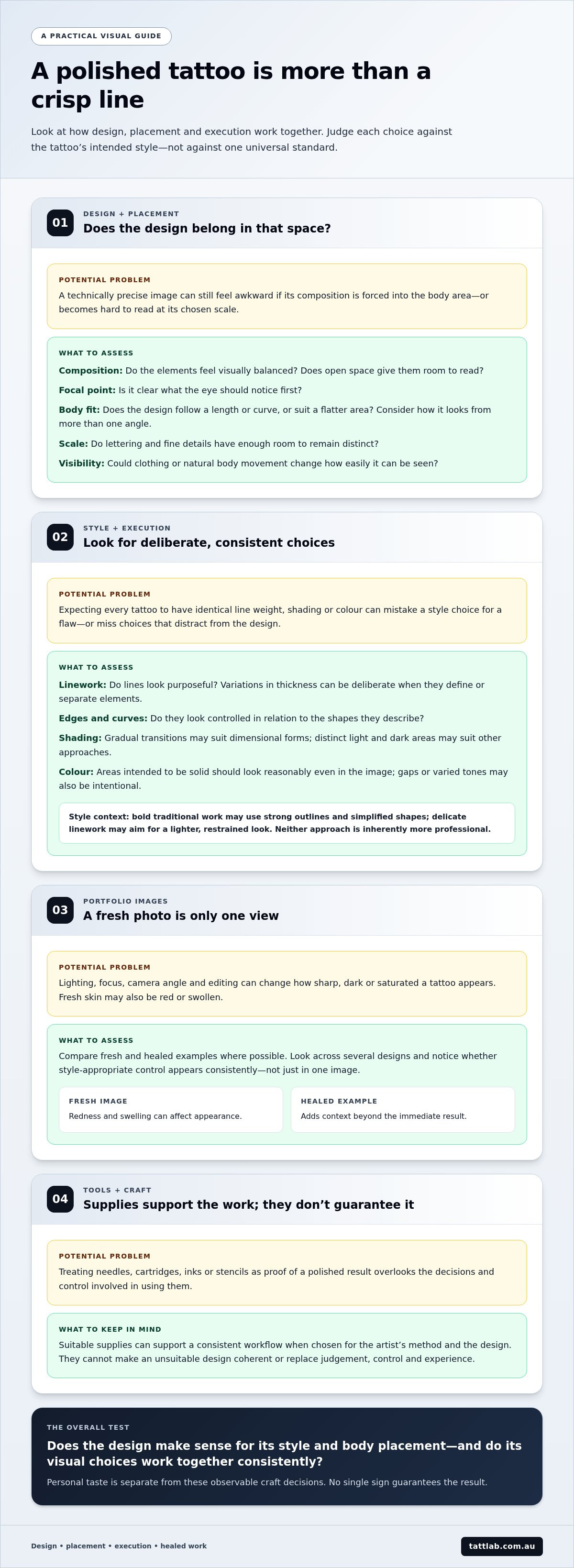
A Practical Checklist for Assessing Whether a Tattoo Looks Well-Crafted
A portfolio can feel easier to judge when you use the same sequence for each example. Start with what’s visible, then separate those observations from personal preference. This checklist can help you assess what makes a tattoo look professional, but it isn’t a guarantee of how any future tattoo will look.
- Step one: Find relevant examples. Look for work in the style and subject matter you’re considering. Relevant examples give you a clearer basis for comparison than unrelated pieces. Notice whether the images show finished tattoos and whether there’s enough detail to assess them.
- Step two: Check design coherence. Ask whether the main elements feel connected, the focal point is clear and the design is easy to understand as a whole. Then consider whether the composition seems suited to the body area, rather than judging only whether you like the motif.
- Step three: Consider scale and placement. Look across several images to see how designs sit on different body areas. Do important details have room to read at the scale shown? Does the placement make the piece visible from a natural viewing angle? These are observations about fit, not a judgement about whether you’d choose that placement yourself.
- Step four: Compare execution and healed examples. Assess whether linework, shading or colour appear intentional within each design’s style. Look for consistency across multiple pieces, and include healed examples where available. Avoid drawing conclusions from a single image, especially if its focus, lighting or editing makes details difficult to see.
- Step five: Separate craft from taste. Decide whether the artist’s visual approach matches your intended outcome. Colour, subject, detail and visual intensity are personal preferences. A style can be a poor fit for you without indicating poor execution, just as a style you love isn’t automatically evidence of technical quality.
In brief: Review relevant work, check design coherence, assess scale and placement, compare style-appropriate execution across images, and look for healed examples. No single style or photograph is the universal standard.
Some signals call for a closer look, not an immediate verdict. One dramatic, highly edited image offers less context than a portfolio with multiple examples showing a consistent approach. Texture may be intentional in one style, while apparent irregularity in another image may come from its resolution or lighting. Don’t diagnose a technical issue from a blurry or heavily filtered photograph; treat unclear evidence as just that, unclear.
Once you’ve identified the qualities that matter in a portfolio, the tools behind a professional workflow can add useful context. Explore tattoo supplies for artists and studios to see categories of equipment and materials used to support consistent work.
How Professional Tattoo Supplies Support a Consistent Studio Workflow
Supplies are part of the process behind a tattoo, but they aren’t a shortcut to quality. Needles, cartridges, inks and stencils support an artist’s workflow when selected to suit the design and working method. Skill and judgement still shape how those materials are used. Understanding this distinction adds context to what makes a tattoo look professional: equipment can support consistency, but it can’t guarantee a particular result.
Matching supplies to the work and the artist’s process
Different needle groupings suit different kinds of work at a broad level. An artist may select one grouping for fine lines and another configuration for shading or broader areas. The choice depends on the design, desired visual effect and artist’s method, rather than a universal rule that one setup suits every tattoo.
Inks also need to fit the intended design and working approach. Colour palette, contrast and the artist’s preferences all inform selection. Stencils can help carry the planned composition onto the skin, giving the artist a reference for placement before tattooing begins. Each is a functional part of a considered workflow, not proof by itself that the finished tattoo will be well-crafted.
Consistency also depends on preparation and appropriate handling of supplies as part of studio hygiene practices. Artists should follow relevant product instructions and established hygiene procedures. Requirements depend on the item and its use, so packaging or a photograph alone isn’t enough to assess safety or quality. For a broader overview of choosing and using equipment, Tatt Lab’s professional tattoo supplies guide explores how supplies fit into a professional workflow.
Aftercare as part of the longer-term picture
The studio process doesn’t end when the tattoo is complete. Aftercare products can support a considered healing routine, while clear instructions from the treating artist explain how to care for the tattoo. Follow those directions, and seek appropriate health advice if you have concerns about your skin. Aftercare supports the process, but no product or routine can promise a specific visual outcome.
For artists, a practical approach is to match supplies to the task, use them as intended and keep technique and hygiene central. For readers, the takeaway is just as simple: materials are one part of professional practice, alongside design decisions, controlled execution and informed aftercare. Browse professional tattoo supplies to explore tools and aftercare products for a considered studio workflow.
Carry a Clearer Standard Into Your Next Step
Your next step doesn’t need to be finding a single flawless example. Decide which qualities matter most to you, then use those priorities to guide your choices. If you’re an artist, consider how your materials fit the work you create and the way you prefer to work. A considered workflow makes room for both artistic judgement and practical preparation.
Supplies can support consistency, but they can’t replace the skill behind the work. Tatt Lab is an artist-owned and operated supplier of professional tattoo and medical supplies for artists and studios, including tattoo inks, needles, cartridges, stencils and aftercare. Explore the range and see what fits your studio workflow.
Explore professional tattoo and studio supplies and keep building your approach with care and confidence.
Frequently Asked Questions
Can a tattoo look professional in any style?
Yes. Professional craft can be expressed across styles because each has its own visual aims. A geometric design may depend on deliberate symmetry, while a loose illustrative tattoo may use expressive marks. Assess whether the choices suit the intended style, rather than whether you personally enjoy them. Taste is individual; proportion, clarity and consistency are observable qualities. No style is automatically more professional than another.
Is crisp linework enough to make a tattoo look professional?
No. Linework is one visible part of the picture, but composition, placement, coherence with the chosen style and healed appearance also inform an assessment. A tattoo with crisp outlines might still feel crowded or poorly suited to its body area. Some designs intentionally use varied, broken or textured lines. Rather than expecting uniform sharpness, consider whether the marks support the image and appear deliberate in context.
Do tattoos always look different after they heal?
A tattoo’s appearance can change during healing, but the degree and nature of change vary. Individual skin and aftercare can influence the process, so a fresh photograph can’t predict a specific appearance. Compare healed examples to understand how work may present after the immediate post-session stage, but treat them as context rather than a promise. Your result may differ from another person’s.
Can a professional tattoo look imperfect in a photograph?
Yes. A photograph can make well-executed work appear uneven or unclear. Harsh lighting may create glare or shadows; soft focus, an awkward angle, skin condition or image compression can obscure details. Before forming an opinion, look for other photographs of the same work or additional portfolio examples. If an image is low-resolution or heavily filtered, it may not provide enough reliable detail for a firm judgement.
Does expensive tattoo equipment automatically produce better-looking tattoos?
No. Equipment is one part of a working process, not a guarantee of appearance. Artist training, design decisions and technique all influence how tools are used, while client-specific factors can also affect the finished work. A higher price tag alone doesn’t show whether a setup suits the task. Focus on whether the artist’s choices and results appear consistent, rather than assuming a particular purchase will improve the visual outcome.
What should I look for in a healed tattoo portfolio?
Look at several healed examples in styles relevant to the work you’re considering. Notice whether key shapes remain readable and whether line clarity and contrast support each design. Compare examples thoughtfully, since body placement, skin and photography differ between people. A portfolio can help you understand an artist’s approach and form more grounded expectations, but it can’t promise that your tattoo will look identical to someone else’s.


Comments (0)
There are no comments for this article. Be the first one to leave a message!